

San Diego businesses must meet both the 2010 ADA Standards and Chapter 11B of the California Building Code. Signs that identify permanent rooms, restrooms, and exits need raised uppercase sans serif characters, Grade 2 braille, and non-glare contrasting finishes, mounted on the latch-side wall with tactile text between 48 and 60 inches above the floor.
Accessible signs are easy to overlook until an inspector, a tenant improvement plan check, or a customer points out a problem. A restroom sign mounted on the door instead of the wall, braille that sits too low, or glossy letters that disappear under a light fixture can all mean a sign has to be remade. For a business owner, the goal is to get these signs right the first time.
This guide explains the main requirements for accessible signage that San Diego businesses deal with: which signs are covered, how tactile characters and braille work, where the signs go, and where California’s rules differ from the federal standard. It draws directly on the 2010 ADA Standards for Accessible Design published by the U.S. Access Board and on the accessibility chapter of the California Building Code. It is general information, not legal advice. For a specific building, a Certified Access Specialist (CASp), your architect, or your sign company can review your plans.
Which rules apply: federal, California, or both?
Businesses open to the public are covered by the Americans with Disabilities Act, and the design requirements for signs are in the 2010 ADA Standards, mainly sections 216 (which signs are required) and 703 (how they must be built). California adopts its own accessibility requirements in Chapter 11B of the California Building Code. Chapter 11B closely follows the federal standard for signs but adds a few requirements of its own.
In practice, a sign in a San Diego business needs to satisfy both. Where the two differ, following the stricter requirement is the safe approach. Your local building department enforces the California Building Code when it reviews and inspects construction.
Which signs have to meet accessibility requirements?
Not every sign in a building is regulated the same way. Section 216 of the ADA Standards sorts signs into categories:
- Signs that identify permanent rooms and spaces (216.2). Restrooms, room numbers, floor numbers, and room names that are not likely to change need both tactile characters with braille and visual characters that meet the standard.
- Directional and informational signs (216.3). Signs that point to rooms or give information about spaces, such as occupancy or rules of conduct, need to meet the visual character requirements, but they do not need raised letters or braille.
- Exit doors (216.4.1). Doors at exit passageways, exit discharge, and exit stairways must be identified with tactile signs.
- Accessible parking, entrances, and restrooms (216.5 through 216.8). Accessible parking spaces are identified with signs, and where not all entrances or restrooms are accessible, the accessible ones are marked with the International Symbol of Accessibility and directional signs point people to them.
Section 216.1 also lists exceptions. Building directories, menus, seat and row designations, occupant names, building addresses, and company names and logos do not have to comply with section 216. Temporary signs that are up for seven days or less are also excepted. So your storefront sign and the logo on the lobby wall are not held to the tactile requirements, but the sign on the restroom door frame is.
| Sign category (2010 ADA Standards) | Examples | Raised characters and braille? |
|---|---|---|
| Permanent rooms and spaces (216.2) | Restrooms, room numbers, floor numbers, room names unlikely to change | Required, plus visual character rules |
| Directional and informational (216.3) | Signs pointing to rooms, occupancy and rules-of-conduct signs | Not required; visual character rules apply |
| Exit doors (216.4.1) | Exit passageways, exit discharge, exit stairways | Tactile signs required |
| Accessible parking, entrances, and restrooms (216.5 to 216.8) | International Symbol of Accessibility and directional signs where not all are accessible | Depends on the sign |
| Exceptions (216.1) | Building directories, menus, occupant names, building addresses, company names and logos, temporary signs up seven days or less | Not required |
What are the rules for raised characters?
Tactile text is meant to be read by touch, so the standard is specific. Under section 703.2:
- Characters must be raised at least 1/32 inch above the background.
- They must be uppercase and sans serif. Italic, script, and highly decorative fonts are not allowed.
- Character height, measured on the uppercase “I,” must be between 5/8 inch and 2 inches.
- Spacing between characters and between lines falls within set ranges, and characters must be at least 3/8 inch away from raised borders or decorative elements.
The standard also advises that signs designed to be read by touch should not have sharp or abrasive edges. That is a good reason to have tactile signs made by a shop that produces them regularly rather than improvising with a router and adhesive letters.
What are the braille requirements?
Every raised character sign must be duplicated in braille. Section 703.3 requires contracted (Grade 2) braille with domed or rounded dots in specific size and spacing ranges. The braille goes below the corresponding text, and if the text runs to more than one line, the braille goes below all of it. It must be separated at least 3/8 inch from the raised characters and from any border or decoration.
Braille translation is a place where errors slip in. Ask your sign maker to confirm how the braille was translated and checked, especially for room names or words that are not in a standard dictionary.
Where and how high should tactile signs be mounted?
A perfectly made tactile sign still fails if it is in the wrong place. People who read signs by touch are trained to look in a consistent spot, so the location rules are strict.
Height
Under section 703.4.1 of the ADA Standards, tactile characters must be at least 48 inches above the floor, measured to the baseline of the lowest tactile character, and no more than 60 inches, measured to the baseline of the highest tactile character.
California measures the minimum differently. The California Building Code, as summarized in the Division of the State Architect’s guide to section 11B-703.4, sets the 48-inch minimum to the baseline of the lowest braille cells rather than the lowest raised letter. Because the braille sits below the text, this pushes the whole sign a little higher. Designing to the California measurement satisfies both.
Position next to the door
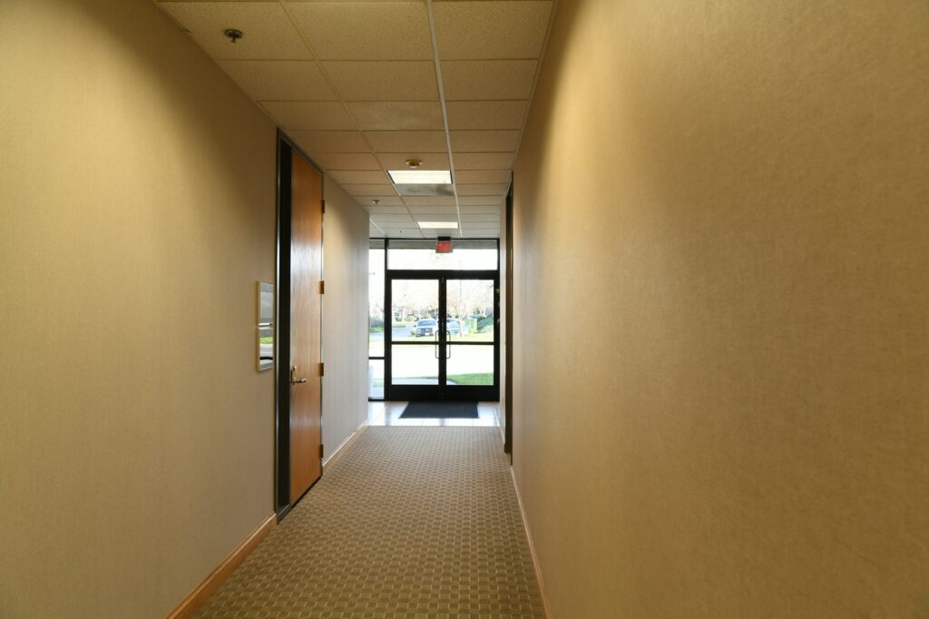
Section 703.4.2 says that when a tactile sign is provided at a door, it goes alongside the door on the latch side. At double doors with one active leaf, the sign goes on the inactive leaf. At double doors where both leaves are active, it goes to the right of the right-hand door. If there is no wall space in those spots, the sign goes on the nearest adjacent wall.
The sign must also be placed so there is a clear floor space of at least 18 by 18 inches, centered on the tactile characters, outside the swing of the door between closed and 45 degrees open. That keeps someone reading the sign from being hit by the door. There is one exception: tactile signs may go on the push side of doors that have closers and no hold-open devices.
California adds that signs identifying permanent rooms and spaces should be located at the entrance to the room, outside it, and that exit signs should be located at the exit door when approached in the direction of egress travel.
What makes visual characters readable?
Visual characters are the printed text people read by sight. Section 703.5 requires:
- A non-glare finish on both the characters and the background.
- Contrast between characters and background, either light on dark or dark on light.
- Conventional fonts, not italic, script, or highly decorative styles.
- A minimum character height based on how high the sign is mounted and how far away the reader will be. A sign mounted at a typical eye-level height and read up close starts at 5/8 inch, and the minimum grows as the sign goes higher or the viewing distance increases.
The advisory note to 703.5.1 points out that shadows from light fixtures, surface glare, and textured backgrounds all make text harder to read. Glossy acrylic might look sharp in a design mockup, but a matte finish usually works better under real lighting.
What does California require for exit signs?
California requires tactile exit signs in more places than many business owners expect. Under section 1013.4 of the California Building Code, as shown in the State Architect’s accessibility guide, tactile signs with specific wording are required at:
- Grade-level exterior exit doors: “EXIT.”
- Exit doors leading to a grade-level exit by a stair or ramp: “EXIT STAIR DOWN,” “EXIT RAMP UP,” and similar.
- Exit doors leading through an exit enclosure or passageway, and exit access doors from rooms into required corridors: “EXIT ROUTE.”
- Doors through a horizontal exit: “TO EXIT.”
These are in addition to the illuminated exit signs most people picture. If you are building out a space, make sure your sign package includes them.
A practical checklist for your space
Before you order signs or schedule an inspection, walk your space with this list:
- List every permanent room and space that has a sign: restrooms, offices with numbers, storage rooms, stairs, and exits.
- For each door, note which side the latch is on, whether it has a closer, and whether anything blocks the wall.
- Confirm there is an 18-by-18-inch clear area in front of each sign location outside the door swing.
- Check mounting height using the California braille baseline measurement.
- Review proofs for font, character height, contrast, finish, and braille placement.
- Add the California tactile exit signs your layout requires.
- Keep your installation measurements and product details in case you need them later.
How can a sign company help?
A sign company that makes accessible signs regularly will already know most of this, but it helps to ask for dimensioned proofs showing character height, braille placement, and the finished mounting height. Ask how the sign attaches to the wall and whether the installer will use your door hardware locations to set position. Accessible room signs are also an opportunity to keep your interior consistent with your brand, within the rules on fonts and contrast. Our article on local business sign design covers how to keep a unified look across exterior and interior signs.
Frequently asked questions
Does my company logo or storefront sign need braille?
No. Section 216.1 of the ADA Standards excepts company names and logos, building addresses, occupant names, directories, and menus from the sign requirements.
Do directional signs need braille?
Directional and informational signs need to meet the visual character requirements for contrast, font, and size, but they do not need raised characters or braille under section 216.3. Signs that identify a permanent room or space do.
Can I mount the restroom sign on the door?
Generally no. The sign goes on the wall alongside the latch side of the door. The exception allows tactile signs on the push side of doors that have closers and no hold-open devices.
What is the correct mounting height?
Under the ADA Standards, tactile characters go between 48 and 60 inches above the floor, measured to character baselines. California measures the 48-inch minimum to the baseline of the lowest braille cells, so plan to that measurement.
Do I have to replace older signs in an existing building?
It depends on the building, its history, and whether you are doing alterations. That question is best answered by a CASp or an attorney familiar with accessibility law, not a general guide.
Final thoughts
Accessible signs are a small part of a build-out, but they are one of the most visible to inspectors and to customers who rely on them. Know which of your signs are covered, get the raised characters, braille, and contrast right, and mount each sign in the location and height the rules call for, using California’s measurement where it is stricter. Ask for dimensioned proofs and work with a sign maker who produces tactile signs regularly. Done carefully, these signs serve every visitor and save you the cost of doing the job twice.